On these first two shots (below), the boys are gathered in and around an armchair by the window, focusing intensely. Chuck has shared pictures of his living room (think back to the last post of the couch and frames on the wall, etc) and has even stated himself that it isn't very big. Yet if you study the many shots he's taken there, they don't feel redundant or "tired". How is that?
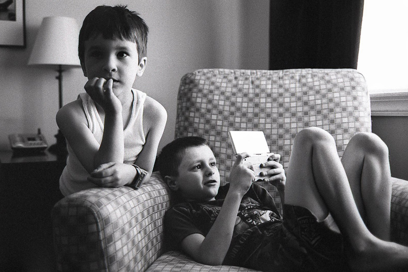
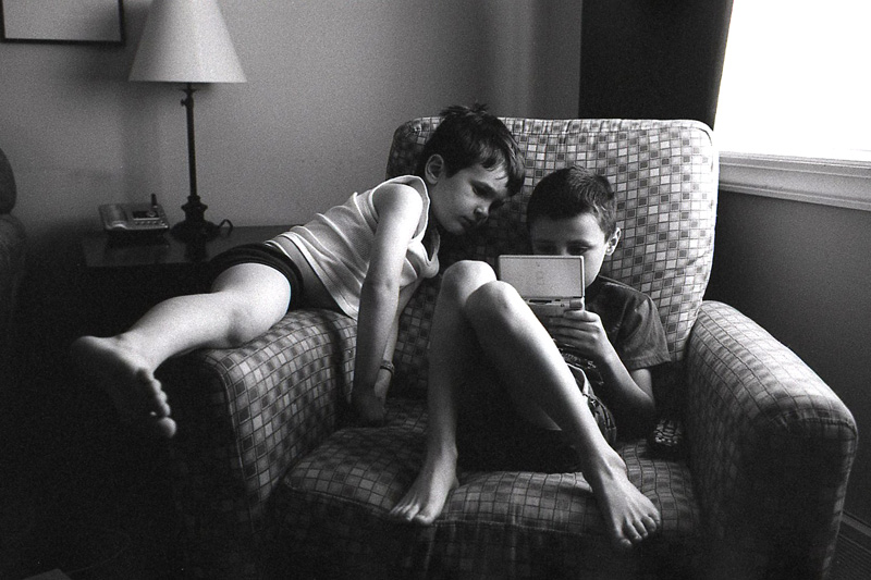
The first shot is a bit more complex than the others in this post. There are two equally interesting subjects with divergent lines of interest. There are two distinct expressions and emotions conveyed here as well. The composition is very straightforward but nicely incorporates the important elements, omitting items which would clutter or detract from the scene. The second image is similar but Chuck is slightly farther away from the boys. These two images look to have been taken around the same time with the same focal length (I didn't view metadata, so I might be wrong on this) yet tell two parts of a larger story of a slow morning. The details are wonderful: the object of attention, the game system, is prominent, the over-sized watch, the "bed head", wife beater and boxer briefs.
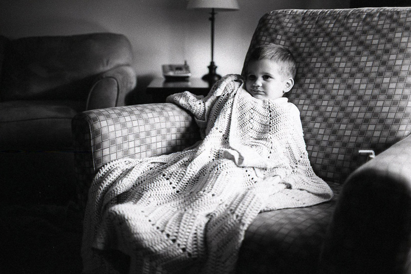
This image below was taken in the same exact chair as the shots above but from an oblique angle, rather than straight on. I love the blanket which engulfs his little body. I love the light from the large window splashing all over him. I love the squished cheek where his hand meets his cheek from underneath the blanket.
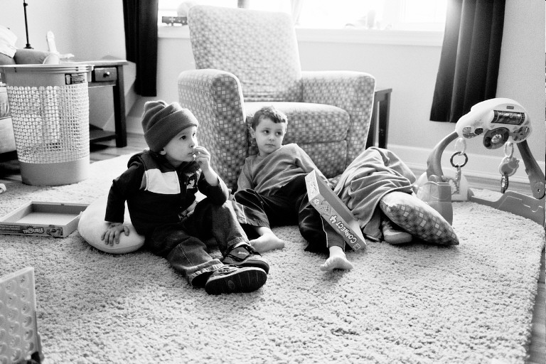
To continue our "one angle of the living room" theme: Below is an older image of Chuck's but there are several things to love about it. Chuck uses the clutter in the room to his advantage. Kids make messes and can be messy. Why try to portray an immaculate house in your images if it isn't ALWAYS truly immaculate? I find these kinds of images endearing, personally, and have plenty of "clutter" images myself. Again, the same chair is in the background (as the other shots) but the angle is slightly different and the composition has a different feel to it. What is most interesting, and should be, are the expressions of those boys, both intently watching the television screen. It offers a quiet moment among the busy-ness and loud natures of most young boys.
What really makes these shots work is not brilliant composition (although, they're well composed images), it's not lighting (hard to beat window light, though), and it's not the gear he used (though Chuck uses stellar gear): what made these shots work is the story they contain and the expressions of his little subjects. They're interesting. They're telling. They're endearing....and they're not even my kids (sadly, i haven't met this famous family).
There are many things that CAN make a great photograph but what consistently makes a good image work is emotion, expression, gestures, etc., things which are telling of the subject. Learn from Chuck. All of the things he does well pale in comparison to his ability to capture genuine emotions and moments which tell a story about his subjects (in this case, family). With all of the terminology and technique and gear relating to photography, it can be quite overwhelming. Chuck's solution for a majority of his shots is the 1ds2 camera body and the 35L. Simplicity. What we should value, above all else, is content in an image. Hopefully, the simplicity and beauty of these images above display that principle well.

To continue our "one angle of the living room" theme: Below is an older image of Chuck's but there are several things to love about it. Chuck uses the clutter in the room to his advantage. Kids make messes and can be messy. Why try to portray an immaculate house in your images if it isn't ALWAYS truly immaculate? I find these kinds of images endearing, personally, and have plenty of "clutter" images myself. Again, the same chair is in the background (as the other shots) but the angle is slightly different and the composition has a different feel to it. What is most interesting, and should be, are the expressions of those boys, both intently watching the television screen. It offers a quiet moment among the busy-ness and loud natures of most young boys.

What really makes these shots work is not brilliant composition (although, they're well composed images), it's not lighting (hard to beat window light, though), and it's not the gear he used (though Chuck uses stellar gear): what made these shots work is the story they contain and the expressions of his little subjects. They're interesting. They're telling. They're endearing....and they're not even my kids (sadly, i haven't met this famous family).
There are many things that CAN make a great photograph but what consistently makes a good image work is emotion, expression, gestures, etc., things which are telling of the subject. Learn from Chuck. All of the things he does well pale in comparison to his ability to capture genuine emotions and moments which tell a story about his subjects (in this case, family). With all of the terminology and technique and gear relating to photography, it can be quite overwhelming. Chuck's solution for a majority of his shots is the 1ds2 camera body and the 35L. Simplicity. What we should value, above all else, is content in an image. Hopefully, the simplicity and beauty of these images above display that principle well.
Thanks for letting me use your images, Chuck. Hope this is useful, guys.
daniel

I love all the shots posted here. Very similar to how I like to shoot my kiddos and my preferred weapon of choice is the 5D + 35L combo. Great stuff. :)
ReplyDeleteAlways a pleasure to read Daniel, thanks.
ReplyDeleteVery educational...thank you for sharing!
ReplyDeleteJust finished reading every single blog post. I was first turned on to fpj by a post of yours on FM (though I didn't know it was you) and I've been obsessed with it since. Thanks for the inspiration! And keep em coming.
ReplyDeleteI love your critiques! One of the hardest things to do is to decipher a good photo. I hope you'd keep updating your blog.
ReplyDeleteThis was great to read thanks
ReplyDelete