Friday, January 29, 2010

Birth Documentaries

My youngest son just turned one this past week! I could say his birth seemed like a blur and that I don't remember much but that's not true. I documented the entire process, from our check-in to the birth event to the days at home that followed our hospital stay. As a result of the documentary process and the photos created through it, I remember it very fondly and with an intimacy that most memories don't enjoy. The photos cover the first 4 days or so of Isaac's birth. My intent was to tell the story, both the good and the not-so-pleasant. The not-so-pleasant moments included contractions, the epidural, and the moments where my wife was emotionally spent. These moments are just as much a part of Isaac's birth as the first time we held him. The photos aren't gratuitous or mean-spirited but rather a way in which we can look back years down the road and know EXACTLY what happened. It's tough to argue with photos, they don't lie (unless they're manipulated, of course). Rather than talk about how to shoot a birth documentary in a technical sense, I want to talk about how I did it and how I decided to shoot what I did.

I carried a Canon 5D with a 35 f/1.4L, 85 f/1.8 and a flash with me. I kept my camera out on a table nearby and only grabbed it when I saw something noteworthy. That way, I could be there and support my wife and at the same time, think about the story I was trying to tell when I wasn't shooting. All but one shot enjoyed natural/ambient lighting in this set.

Here is the story with occasional comments on some:

I tried to stay very alert to what was happening around me, the mood in the room.
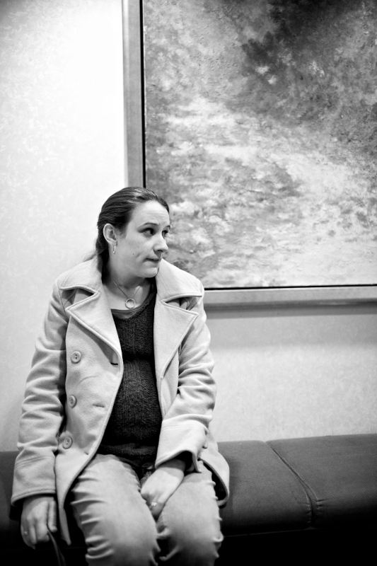
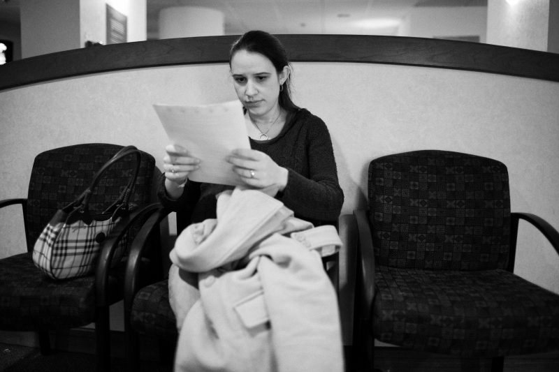
This image captures my wife's nervous and tentative mood, right after we arrived, waiting for the nurse to call us to fill out paperwork.

http://www.pbase.com/anerino/image/121505454

http://www.pbase.com/anerino/image/121505455

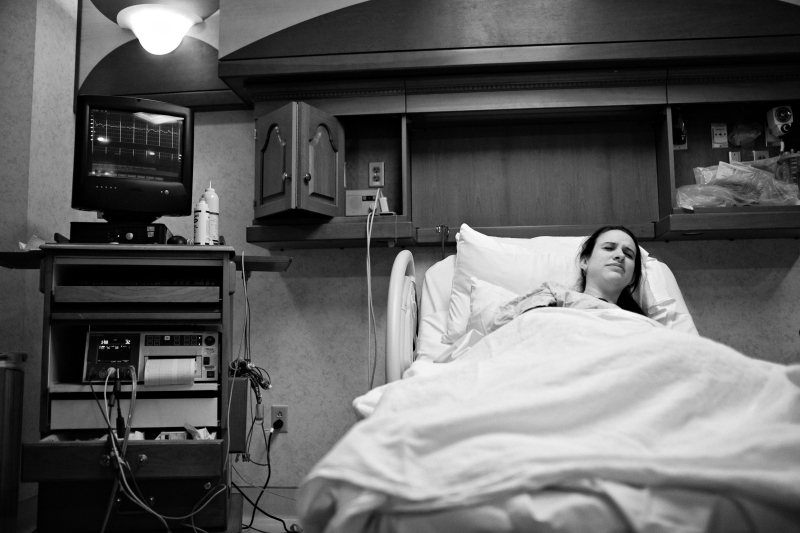
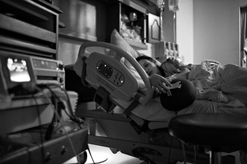
This is the first painful contraction I remember my wife having after we arrived. I showed the monitors in relation to her facial expression, both of which say the same thing (including the context of the hospital room helped me establish the story and setting). I later showed the photo to her in between contractions and she was surprised that it looked that painful.

http://www.pbase.com/anerino/image/121505456

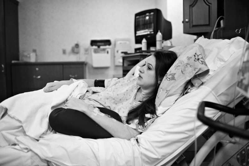
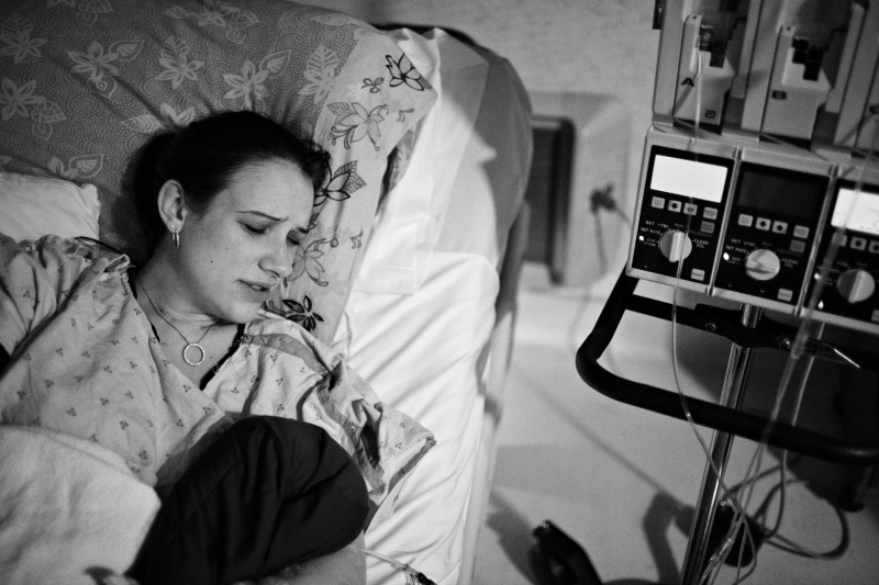
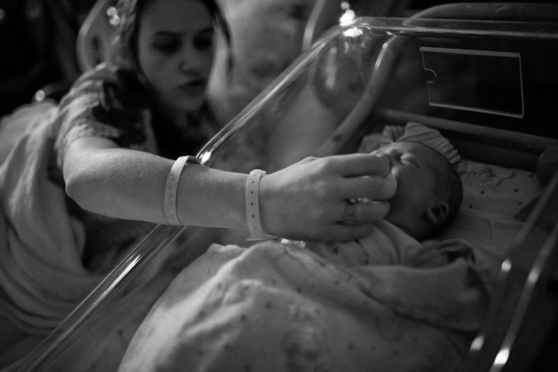
You'll also notice I have several angles of my wife in the hospital room. We were there for more than 20 hours before Isaac came along and I think the number of shots conveys that. I also had a lot of down time, so I visually explored the room, tried different angles and compositions. Some of them worked and some of them didn't.

http://www.pbase.com/anerino/image/121505457

http://www.pbase.com/anerino/image/121505458

http://www.pbase.com/anerino/image/121505459

I almost didn't take this shot. My wife was nervous about the epidural and the nurse encouraged me to sit down. I decided the shot was important and took only one to record it before putting the camera down on a nearby tray table.

http://www.pbase.com/anerino/image/121505460

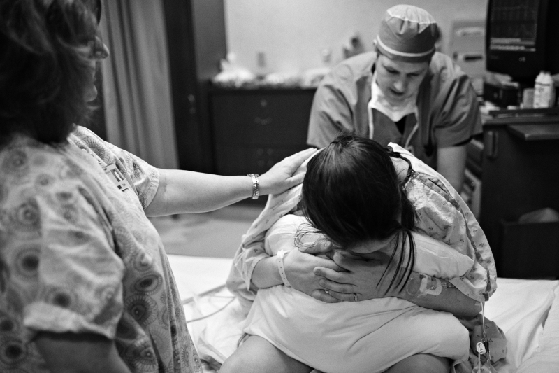
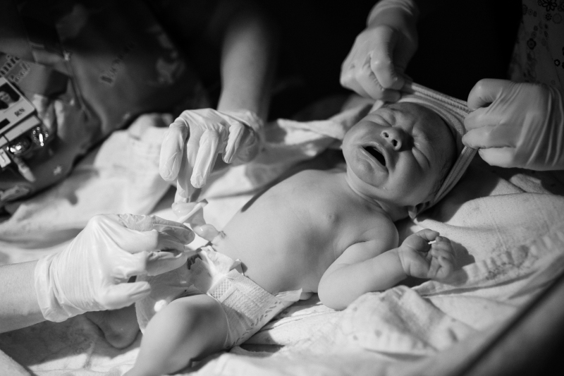
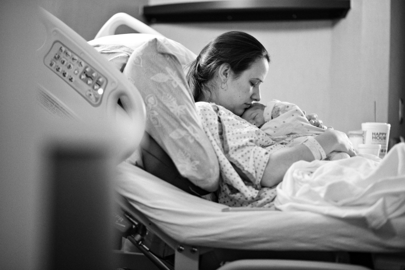
I also almost didn't take this one. I didn't want to focus on photography during the birth and I didn't. At the last minute, I decided I couldn't NOT take a photo and grabbed the camera which was hanging off my shoulder, shot it with one hand--while holding my wife's hand with the other--very quickly and then put it back on my shoulder.

http://www.pbase.com/anerino/image/121505461

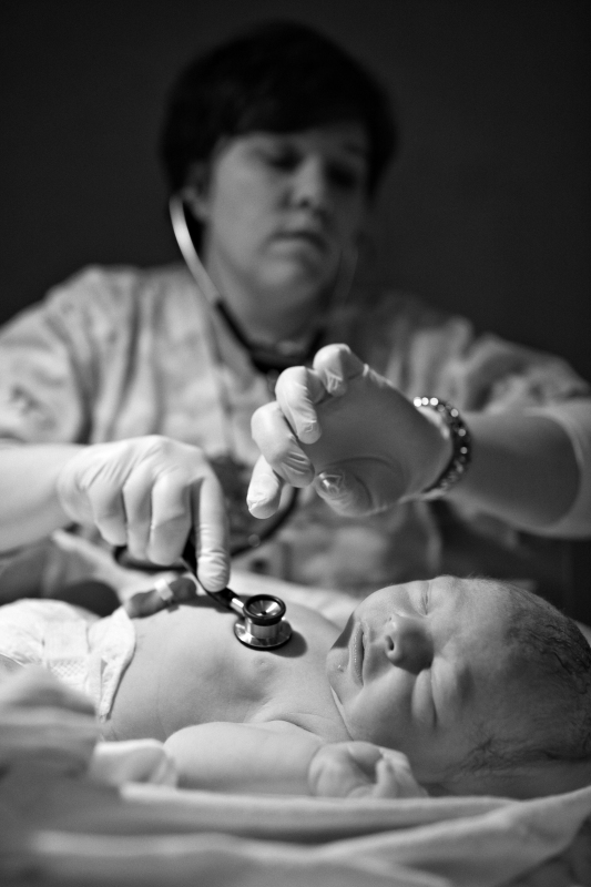
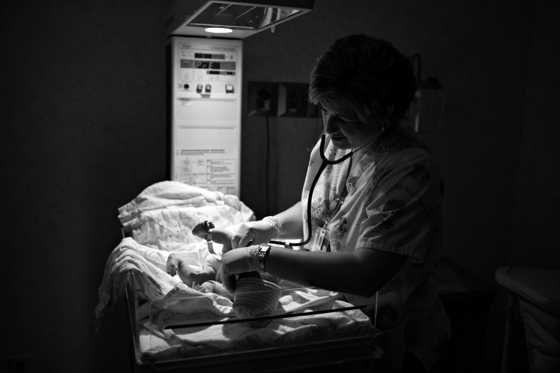
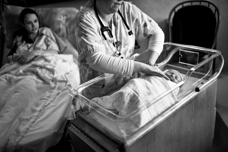
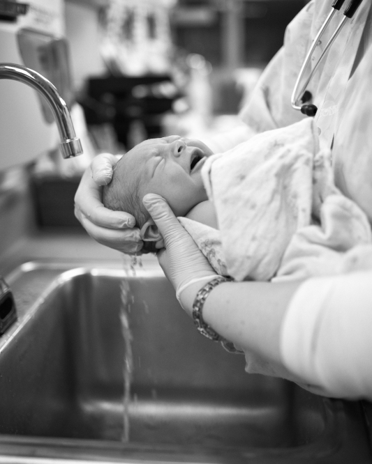
This next series of Isaac with the nurses was a very calm period, very quiet (except for him). I quietly moved into position and snapped a few. I had time to do this, so I carefully composed each, trying to expose for the mood (the bright lamp added a little drama, which I liked).

http://www.pbase.com/anerino/image/121505464

http://www.pbase.com/anerino/image/121505462

http://www.pbase.com/anerino/image/121505467

http://www.pbase.com/anerino/image/121505463

http://www.pbase.com/anerino/image/121505465

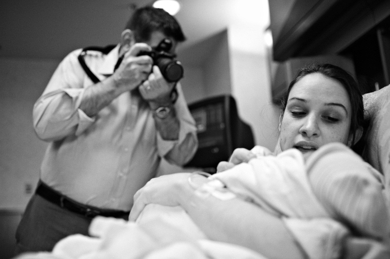
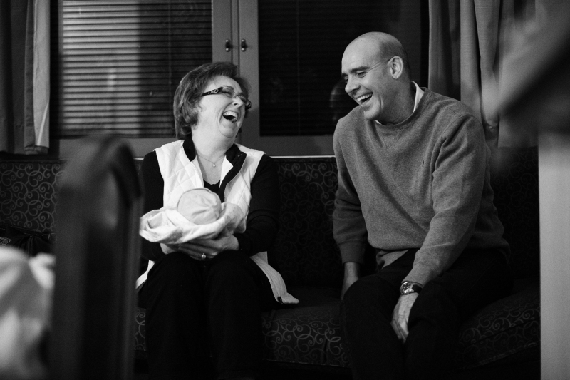
I thought this photo told a great story. My dad, "the papparazzi", snapping away at his new grandson. I thought layering mother/son and grandfather would provide more context to what was happening, the newness of it all/a sense of the moment.

http://www.pbase.com/anerino/image/121505466

http://www.pbase.com/anerino/image/121505468

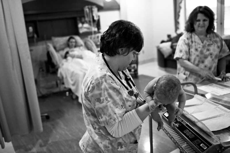
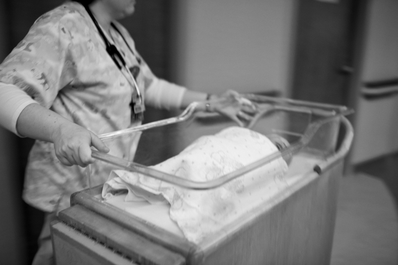
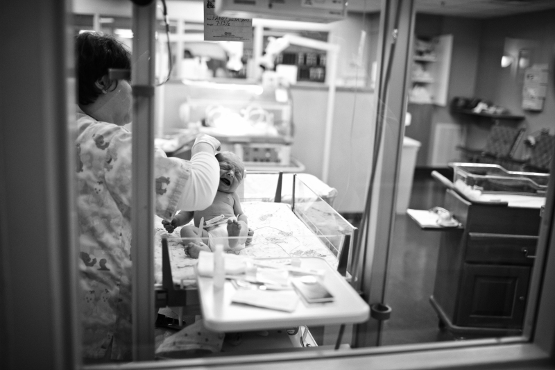
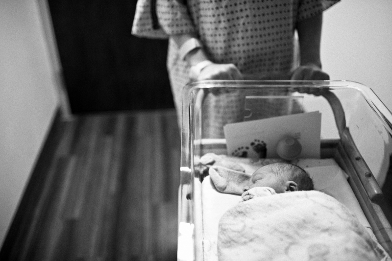
I slowed my shutter speed to take advantage of the motion of the nurse pushing Isaac through the hallways.

http://www.pbase.com/anerino/image/121505469

http://www.pbase.com/anerino/image/121505470

http://www.pbase.com/anerino/image/121505471

This shot was another which I had not planned to take. As I went out of the nursery to visit my oldest son and my parents (who were watching him), I looked back in and saw the scene, framed naturally by the window. Had to take that.

http://www.pbase.com/anerino/image/121505472

http://www.pbase.com/anerino/image/121505473

http://www.pbase.com/anerino/image/121505475

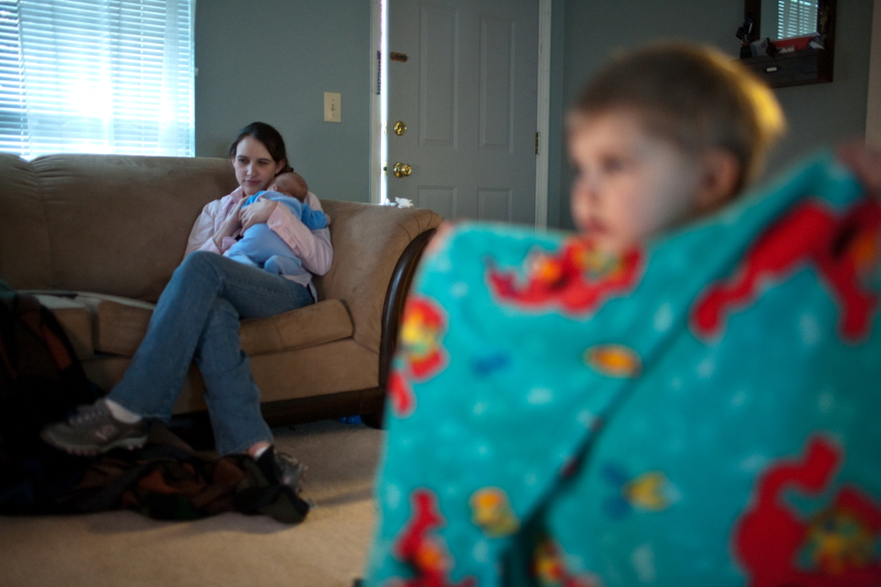
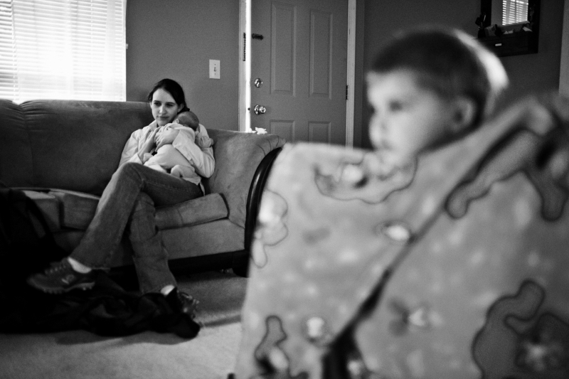
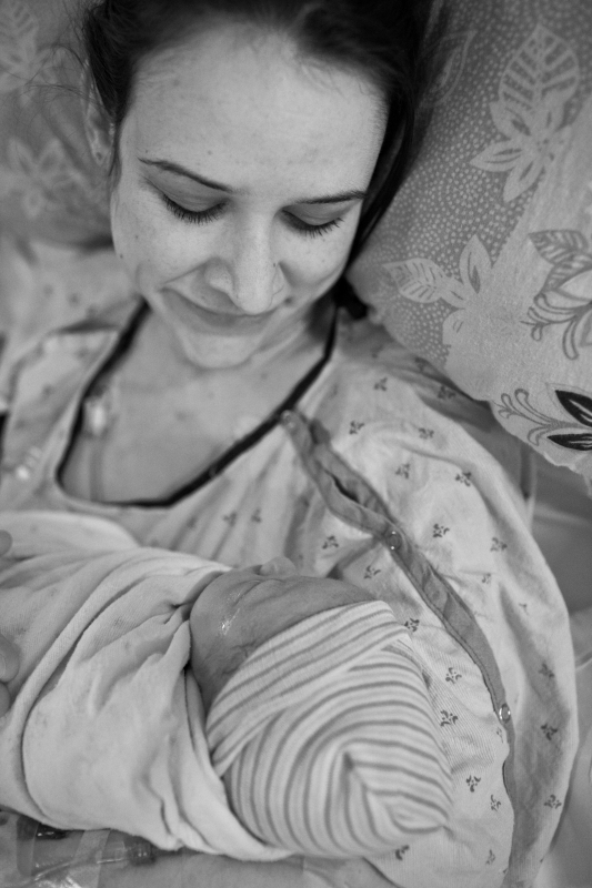
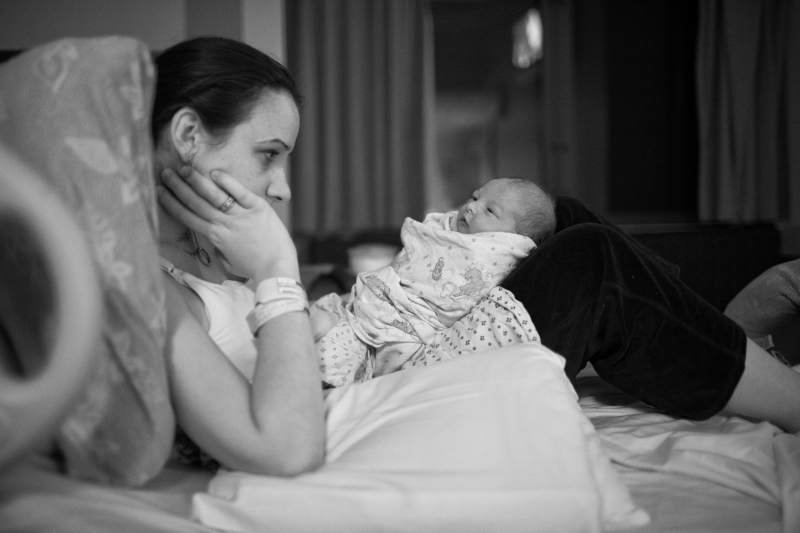
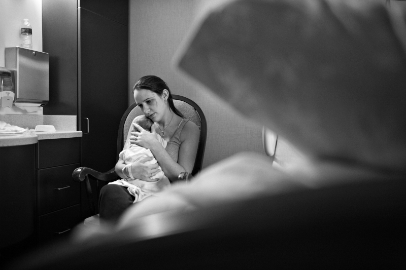
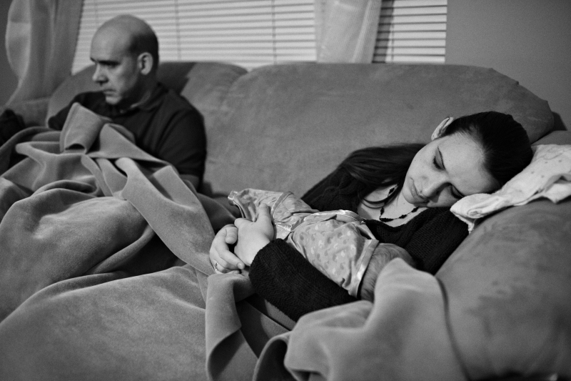
Isaac was a bit fussy those first days and wanted to be held a lot. My wife was very tired most of the time and held him quietly, enjoying the moments of rest. I didn't say anything, just quietly composed and captured the moment and I never asked her to pose for me.

http://www.pbase.com/anerino/image/121505476

http://www.pbase.com/anerino/image/121505477

http://www.pbase.com/anerino/image/121505489

Isaac was tough to get to sleep. It was a hard night. This shot is an example of taking pictures when things are not-so-pleasant. We can look back on these moments as the reality of having a newborn child and being exhausted ourselves.
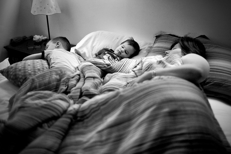
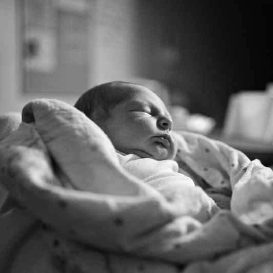
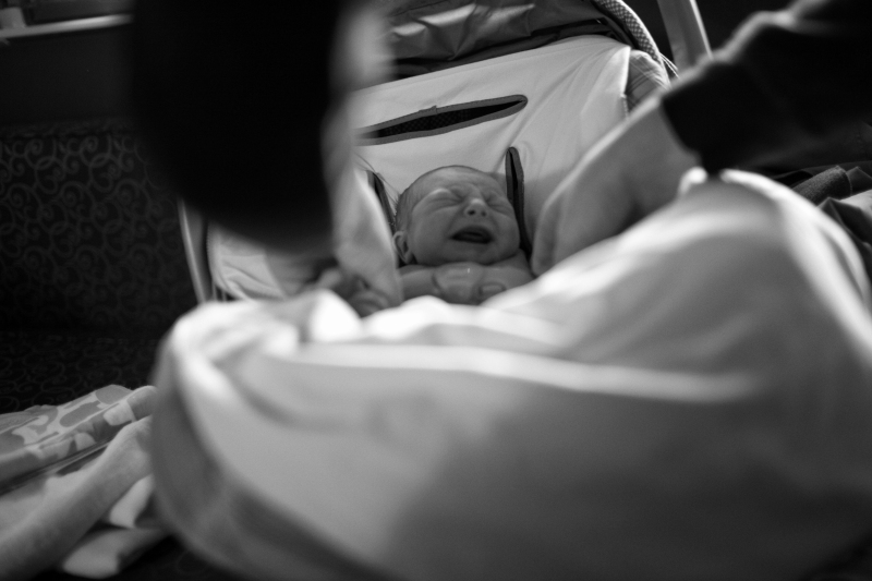
For this shot and the next, it was truly dark in the room and my camera wouldn't achieve focus. Rather than use flash or turn on lights, which would disturb my wife and Isaac, I quickly manually focused, bracketing my focus to ensure I got something sharp. Sometimes, it's about getting the shot, not getting it perfectly. I happen to like this one but the point is, I told the story even if it is not perfectly sharp.

http://www.pbase.com/anerino/image/121505490

http://www.pbase.com/anerino/image/121505491

http://www.pbase.com/anerino/image/121505492

http://www.pbase.com/anerino/image/121505493

http://www.pbase.com/anerino/image/121505494

http://www.pbase.com/anerino/image/121505495

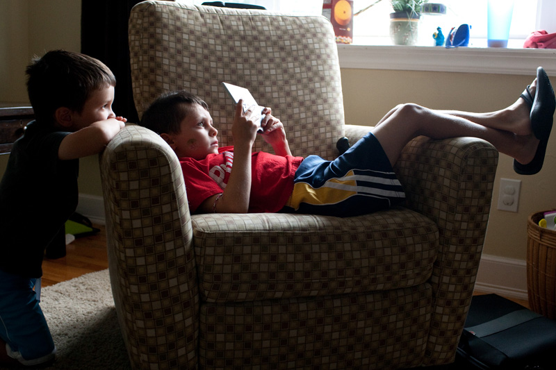
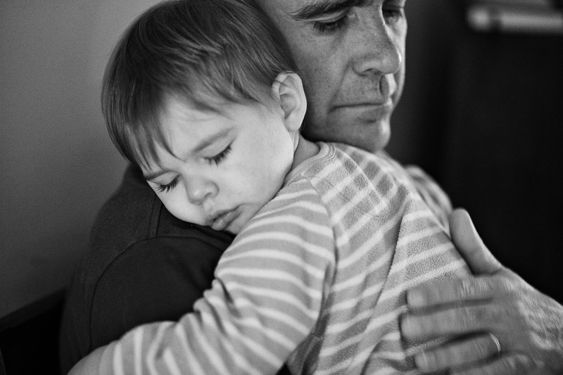
Henry (my oldest) was both excited for and jealous of his new brother. After one particular meltdown, my father-in-law calmed him, then held him as he slept. I shot tighter on them because I wanted to isolate the two of them together.
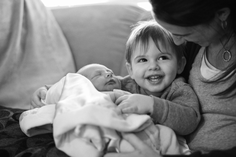
This shot contrasts well with the shot of Henry holding Isaac for the first time (a couple shots back in this set). It tells a more complete story by having them both.

http://www.pbase.com/anerino/image/121505496

http://www.pbase.com/anerino/image/121505497

Things are not always peachy and all smiles. Life isn't like that. The goal of a documentary series isn't to idealize or glamorize what happened, but to tell the reality of what happened in an honest way. There's a place for the more glamorous side of child/infant portraiture. But the family photojournalist is concerned with story telling and capturing genuine moments. Each shot should tell part of that story. I hope that this series gives you a spring board into telling your own stories, particularly with telling birth stories.

Thanks for stopping by, guys.

daniel

Tuesday, January 26, 2010

Essential Gear for The Family Photojournalist

Essential Gear for the The Family Photojournalist

I have heard many times that “gear does not make the photographer”. I agree with this statement to a certain extent. The finest equipment in the world will not find good light and it will not compose a fine photograph. But, I will say, “better equipment helps photographers make better images.” Better lenses are sharper, offer more contrast, and allow more light into the camera. Better cameras are faster, made with stronger materials, and can shoot in a wider variety of lighting situations. So I believe that it is naïve to oversimplify and claim, “gear does not matter.”

Choosing gear as a family photojournalist can be a daunting task as there seem to be endless equipment offerings. I look at gear selection for the family photojournalist a lot like choosing how we dine out! We might opt for McDonalds if we are low on funds. Maybe you’ll head out for a casual bite to eat at TGI Friday’s when out shopping with your significant other. Perhaps you might have the occasion to celebrate a big raise you received and you invite your friends to Morton’s Steakhouse. Or you just hit the lottery and you are lucky enough to hire a personal chef! Or you are like many people around this time of year and you are trying to drop a few pounds so you go on a diet. We would all agree that each of the above dining options will certainly do the job filling our bellies, but we might enjoy one option over the other. Choosing camera equipment to document your family is no different!

So, like dining out, I have compiled five different sets of equipment for the family photojournalist based on five budgets: The McDonald’s, The TGI Friday’s, The Morton Steakhouse, The Personal Chef, and The Diet.

DISCLAIMER: I am well versed in Canon equipment having owned (at one time or another) virtually all of their DSLR camera bodies and most lenses they offer. I would also recommend using Nikon gear as they have an excellent reputation and offer a wide array of products for the DSLR user. But keep in mind, any DSLR (or SLR) camera will suffice and most companies offer comparable products!

I will be recommending lenses that will have a maximum aperture of f/2.8 and wider so that the family photojournalist will be able to shoot indoors without flash. I will also recommend a telephoto zoom to help document your children’s events (dance, plays, sporting events, etc).

The McDonald’s:

Camera: Canon XSi (body only) ($459)

Prime Lens: Canon 35mm f/2 ($299)

Zoom Lens: Tamron 28-75mm f/2.8 ($459)

Supersize It: Replace the Canon XSi with a Canon T1 ($659) and add a Canon 75-300mm telephoto lens ($159) (for your child’s outdoor sports event).


The TGI Friday’s:

Camera: Canon 50D (body only) ($959)

Prime Lenses: Canon 24mm f/2.8 ($339) and Sigma 50mm f/1.4 ($499)

Zoom Lens: Tamron 17-50mm f/2.8 ($449)

Telephoto Zoom: Sigma 70-200mm f/2.8 ($799)


The Morton’s Steakhouse:

Camera: Canon 5D mark II (body only) ($2499)

Prime Lenses: Canon 24L II f/1.4 ($1699) and Canon 35L f/1.4 ($1369)

Zoom Lens: Canon 16-35mm f/2.8 ($1520) and Canon 24-70mm f/2.8 ($1339)

Telephoto Zoom: Canon 70-200IS f/2.8 ($1799)


The Personal Chef:

Camera: Leica M9 ($6995)

Prime Lenses: Leica 24mm f/1.4 ($6495), Leica 50mm f/0.95 ($10,500), Leica 75mm f/2 ($3300)


The Diet:

Camera: Canon XS with 18-55mm lens ($499)

Lens: Canon 50mm f/1.8 ($89)


All of the above prices are based on B and H Photo (www.bhphotovideo.com). Buying used equipment is also an option if one were inclined to shave a few dollars off of the budget. I rarely buy new and have made many flawless transactions at www.fredmiranda.com Buy and Sell forum.

The kits listed above are just suggestions. In reality, the family photojournalist can document the large majority of family life with any DSLR and lens listed above. For example, I shoot primarily with the Canon 1ds2 (bought used) and a Canon 35mm f/1.4 lens.

The images below were taken with the 35mm f/1.4 lens. This has been my favorite lens for the past few years. I think the focal length is perfect for most of my shooting and it has a very wide aperture of f/1.4 that allows me to shoot in most situations without using a flash.

http://www.pbase.com/anerino/image/120693667


http://www.pbase.com/anerino/image/120693654


http://www.pbase.com/anerino/image/117456638


This photo really demonstrates why I feel that lenses with wide apertures are invaluable. Without a wide aperture, I could not have taken this shot. My exposure settings were: 1/60th, f/1.4, ISO 6400.

http://www.pbase.com/anerino/image/114730942


As always, thank you for checking in!


Best Regards,

Chuck

Wednesday, January 13, 2010

Why black and white? Part 2

4. Black and white images can be instantly classic. It's more difficult to pin down when a black and white image was taken than a comparable color image. Part of that lies in the colors of our world, which change over time. People's choice of color processing can change and color of clothing and make up also change. These all give hints and clues as to when the picture may have been taken. Without that information, we are left to our imaginations as viewers. It adds a hint of mystery and intrigue. We are allowed to explore the image, the subjects, their contexts, and interpret what is happening because less information is given to us in a b&w image than in a color one. Here is a quick example for comparison.

http://www.pbase.com/anerino/image/121078347

http://www.pbase.com/anerino/image/121078345

a. Notice that the color shot seems to have a lot more information for the viewer to digest. It's color itself.
b. You notice the pink on my wife's shoes, her pink shirt contrasted against the blue onesie, the bright red and blue of the elmo blanket in the foreground, etc.
c. Now, view the b&w again. Much of those potential distractions have been removed.
d. The blanket in the foreground no longer draws the eye away from the real moment of a mother comforting her newborn baby.
e. The color of clothing and the shoes are irrelevant and no longer draw the eye, either.
f. Now we are left with something more simple, stripped down, and conceptual. And without color, there is little that could truly date this image (well, maybe the couch).

B&w images have a more classic feel, don't they? There's not only a sense of nostalgia that we have for them but the simplicity of these images draws us in and invites us to explore them in a way that I would argue many color images cannot. Chet Raymo in The Soul of the Night, says "In New England in October anyone can take a pretty picture, and most do....Point the camera in any direction, snap the shutter, and the image is certain to please." He suggests that the photographer must pay greater attention to his or her selection of subject matter, lighting, composition, tonality, and even color, in order to make a good b&w. The simple fact of beautiful color in an image can no longer make a photo work. The photographer now has to dig deeper and use content to entice the viewer.

5. B&w images are conceptual. Almost instantly, a shot of my son running down stairs on a playground becomes a slice of childhood. As children, we all played on playgrounds, explored jungle gyms, and remember them fondly (for the most part). We can more easily connect to a b&w version of an image because of its conceptual nature, it's timelessness. We aren't drawn to the color of the clothing or its surroundings. We can tell it's a wooden gym and that is all the information we need on that.

http://www.pbase.com/anerino/image/121078507

I will add that the compositions of these images also lends themselves to the same timeless theme. B&w conversion isn't magic. There's a great deal that goes into a great b&w image, more than just the absence of color. My sons playing hide and seek is an example. They aren't paying attention to me. They're engrossed in their game and the timing is right. The activity is something that most of us did as children and we can relate, it's not only action oriented but conceptual, lending itself to a more timeless feel. The b&w conversion, then, allows us to focus on them without extraneous details such as color.

http://www.pbase.com/anerino/image/120803955

I promise you I don't hate color. I do hope that this mini-series on black and white has helped you to understand at least part of why it's so effective and why Chuck and I use it frequently in our work, both professionally and personally.

daniel

Monday, January 11, 2010

Why black and white? Part 1

I've been asked why I convert anything I deem worth keeping into black and white. The simple answer: it's extraordinary and beautiful and simplifying...and I love it. But there are other reasons to convert to black and white (b&w), a few of which we'll explore. First off, let me say I've got nothing against color. Some of my favorite photographers use color: Sam Abell, Steve McCurry, Ron Haviv, David Alan Harvey, and many others. It's simply a personal preference of mine for a number of reasons. To begin, let's look at a color photograph.

1. Color can be vibrant and eye catching. Just look at this shot by Steve McCurry:

http://www.pbase.com/anerino/image/121012200

a. This image rests, in part, on its vibrant and exotic colors as well as the brilliant contrast of red cloth against the brown, dusty surroundings.
b. Without the faces of these women and without an engaging setting, color is its own subject. It calls attention to itself, and rightly so.
(I'll stop here at analyzing the shot for the sake of time.)

c. One benefit of black and white can be that color is no longer a factor.
d. Color cannot pull attention away from the point of interest in a b&w image.
e. For family photojournalists, who often shoot in less than exotic and vibrant locales, b&w is a way to simplify the image, a way to keep the viewer's eye on what you intend for them to see: the child/children/action/etc.
f. B&W strips away excessive elements that may cause a color shot to drown in details.

Again, this is a benefit in many cases, but not in all and certainly not a "rule". Here is a quick example of an image which works in color but after its conversion to b&w, you notice a greater contrast between my son and the couch. In the b&w image, his hair and clothing are tonally darker than the white couch and immediately stand out.

http://www.pbase.com/anerino/image/121012596


http://www.pbase.com/anerino/image/121012597


2. B&w images rely on tonal values, lights and darks. In the last blog entry, you'll remember Chuck's encouragement to use window light. Look back at those images and notice the steep fall off of light coming through the window. It helps the subject to stand out when there is that kind of fall off--it draws the eye toward the brighter object (which should be your subject). That is also why people add vignettes to their images--as the image darkens, it draws attention back to the lighter subject, which brings attention back to what the photographer intended for you to see in the first place. Here is another quick example of high contrast:


http://www.pbase.com/anerino/image/121012690


In the above image, the light from outside nicely outlines my son as he navigates the playground. As with window light, this type of lighting falls off quickly so that the viewer can see very little of the inside of the tunnel, calling attention back to my son who is also framed nicely by the doorway.

3. Since a black and white photograph can't rely on color to make it interesting, there's an increased emphasis on content, lines, and form.

a. Good photographs, whether color or b&w, employ these things to engage the viewer and to make a statement.
b. Once converted to b&w, line and form are immediately enhanced since the viewer cannot help but explore a b&w image in a different manner than he/she would study a color image.

http://www.pbase.com/anerino/image/121079228

The previous image is a bit odd and abstract. The receding line of the staircase is balanced by the semicircles of both the cropped clock and head (of my son). Using lines and forms doesn't have to be abstract, though. They can be relatively straight forward. Example:

http://www.pbase.com/anerino/image/120803954

Here are a couple more shots (photographers unknown) which illustrate the power of lines and form in b&w photography:

http://www.pbase.com/anerino/image/121184694

http://www.pbase.com/anerino/image/121184773

Notice how these two shots are powerful in their simplicity. The compositions and nature of b&w itself pulls the viewer into the lone subjects of these respective photos and causes their forms/shapes to stand out and engage us.

Hopefully, this is a thoughtful and useful exercise in understanding black and white. More to come in part 2.

daniel

Friday, January 8, 2010

Tutorial: The "Seeing in Black and White" Black and White Conversion


The “Seeing in Black and White” Black and White Conversion!

As I am sure you noticed by now, I like black and white photographs! When I first began taking photographs, I chose to convert to black and white for a few reasons (both the wrong reasons). First, I thought it made me an artist (its pretty funny to admit that). Second, I had ZERO understanding of white balance and fell in love with the phrase, “when in doubt, convert it out!”. Since those days, I have taken great pride in my black and white conversions (I use several techniques). I will cover many different conversion methods as this blog grows.

Today, I am going to focus on the “Seeing in Black and White” conversion method where much of the “conversion” is done when you take the shot vs. trying to do it all in Photoshop! Yep, it’s that easy! This technique is accomplished literally 10 seconds in Photoshop! However, in order to get the best results, there are a few variables that you should be looking when photographing your subjects since this method requires you to analyze the scene before hand.

--The photograph must be taken in “good” light (I prefer window light).

--Where is the light coming from? Where are the shadows? Where is your subject in relation to light and shadows?

What is “good” light? Tough question because virtually any light can be “good” if the photographer uses it correctly. So for the purpose of this exercise, lets oversimplify “good” as “soft, directional light”. For an example of this type of light, turn off the artificial lights in a room where there are windows on one wall around 1pm. Look how the light comes into the room. Look where the shadows fall. Note that the direction of the light is provided by the location of the window.

I am going to use a photograph of my nephew and my son playing the Nintendo DS to demonstrate this technique. This was a completely candid moment.

The first image below is the straight out of the camera (SOOC) shot that was taken. It was shot at 1/160th of a second, f/4, ISO 1600 @ 35mm shot in full manual mode. I obtained the exposure by spot metering the boy in the chair’s face.

http://www.pbase.com/anerino/image/120916096

Just some detail about why I employed the “Seeing in Black and White” technique with this photograph. I knew that conditions were ideal for a black and white photograph before I even pressed the shutter. First, the light was “good” (soft and directional). Second, it was coming from the large bay window my living room. It is the only window in the room. All artificial light was turned off. I think many people make the mistake of leaving lights on when working with window light. Additional lighting will kill the shadows. Third, my subjects were facing the perfect direction for this method of conversion (the light source evenly lit both of their faces). Shadows were cast behind my subjects forcing attention on their faces.

By using the “Seeing in Black and White” method, you drastically limit the amount of time you need to spend in Photoshop. Here is what I did in Photoshop to get to the image below:

1. Open image.
2.
Click “Image” > “Image Adjustments” > Channel Mixer.
3.
With the Channel Mixer dialogue box open, check “monochrome”.
4.
Enter values 25, 35, 40 and click “OK”.

I spent literally 10 seconds to achieve the “Photoshop conversion” below because I gave some thought BEFORE I took the photograph by “Seeing in Black and White”.

http://www.pbase.com/anerino/image/120916099

Taking your Black and Whites to the next level.

We could stop at the conversion above and have a really solid black and white image. But if we make a few more clicks we can even out some of the tones of the image by “Dodging and Burning”.

How to Dodge and Burn in Photoshop

1. Duplicate your layer (CMD + J).
2.
Click “Edit” > “Fill”
3.
Choose “50% Gray” from the Contents pull down and click “OK”.
4.
Go to your “Layers Palette” and set the gray layer to the “Overlay” blend mode.
5.
Select your paint brush. Make sure the “hardness” of the brush is about 50%. Make sure the opacity of your brush is around 12% and the flow around 30%.
6.
Set the color of your brush by using the shortcut “D” (that’s right, just press “D” on your keyboard and the colors will turn black and white).
7.
To brighten an area, make sure white is selected. To darken an area, make sure black is selected (“X” switches between the two colors).
8.
With the color desired, simply paint areas that you feel need lightening/darkening.
9.
Flatten your layer when you are finished (Layer > Flatten Layer).

I did not dodge any of the area below, but I did burn the edges of the photograph as well as the chair and carpet.

http://www.pbase.com/anerino/image/120916100

“So your black and white conversion is the channel mixer?! WTF!?” The short answer is “YES, sometimes!”. The reality of it is that my favorite way to do a black and white is to shoot the scene in “good” light and spend minimal time working in Photoshop. "So you always shoot in good light?". I try to. In cases where I ideal light is not available, I use different techniques...so stay tuned!

I firmly believe that analyzing how you look the light in any given scene will enhance your black and white photographs, which will ultimately give greater depth to your family photojournalism.


Thanks for checking in!

Best Regards,

Chuck