
1. Color can be vibrant and eye catching. Just look at this shot by Steve McCurry:
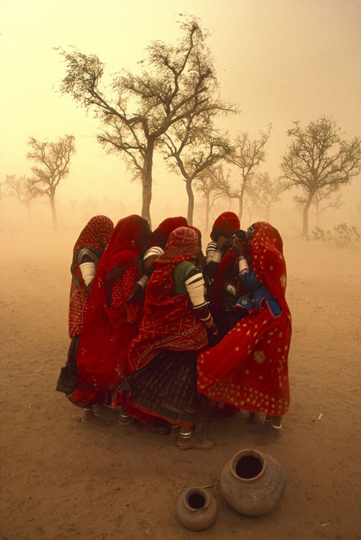
a. This image rests, in part, on its vibrant and exotic colors as well as the brilliant contrast of red cloth against the brown, dusty surroundings.
b. Without the faces of these women and without an engaging setting, color is its own subject. It calls attention to itself, and rightly so.
(I'll stop here at analyzing the shot for the sake of time.)
c. One benefit of black and white can be that color is no longer a factor.
d. Color cannot pull attention away from the point of interest in a b&w image.
e. For family photojournalists, who often shoot in less than exotic and vibrant locales, b&w is a way to simplify the image, a way to keep the viewer's eye on what you intend for them to see: the child/children/action/etc.
f. B&W strips away excessive elements that may cause a color shot to drown in details.
Again, this is a benefit in many cases, but not in all and certainly not a "rule". Here is a quick example of an image which works in color but after its conversion to b&w, you notice a greater contrast between my son and the couch. In the b&w image, his hair and clothing are tonally darker than the white couch and immediately stand out.


2. B&w images rely on tonal values, lights and darks. In the last blog entry, you'll remember Chuck's encouragement to use window light. Look back at those images and notice the steep fall off of light coming through the window. It helps the subject to stand out when there is that kind of fall off--it draws the eye toward the brighter object (which should be your subject). That is also why people add vignettes to their images--as the image darkens, it draws attention back to the lighter subject, which brings attention back to what the photographer intended for you to see in the first place. Here is another quick example of high contrast:
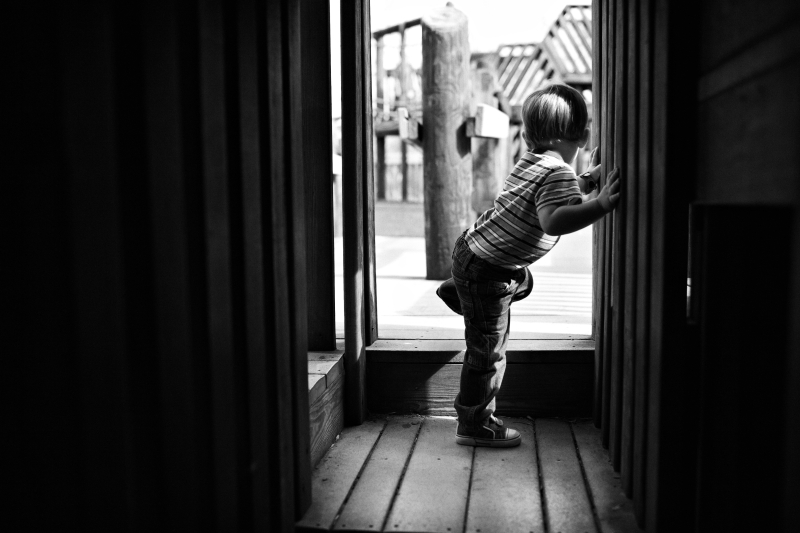
In the above image, the light from outside nicely outlines my son as he navigates the playground. As with window light, this type of lighting falls off quickly so that the viewer can see very little of the inside of the tunnel, calling attention back to my son who is also framed nicely by the doorway.
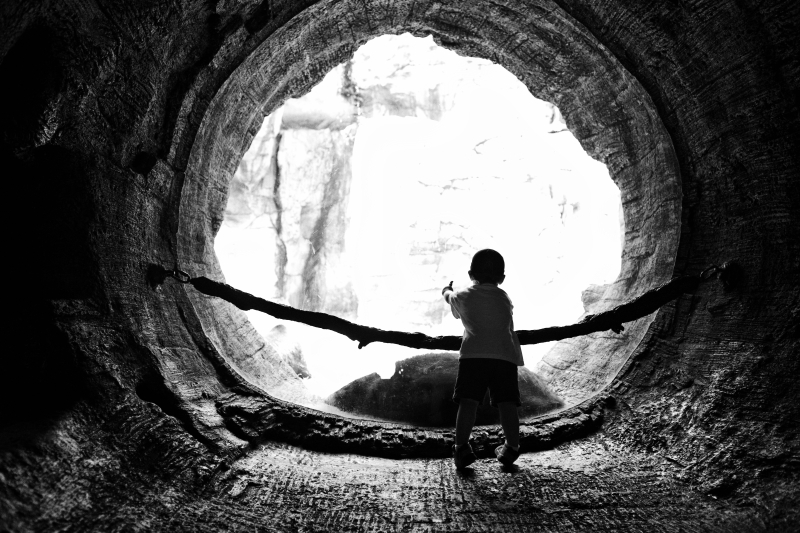
3. Since a black and white photograph can't rely on color to make it interesting, there's an increased emphasis on content, lines, and form.
a. Good photographs, whether color or b&w, employ these things to engage the viewer and to make a statement.
b. Once converted to b&w, line and form are immediately enhanced since the viewer cannot help but explore a b&w image in a different manner than he/she would study a color image.

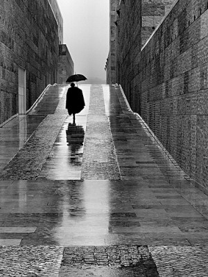
The previous image is a bit odd and abstract. The receding line of the staircase is balanced by the semicircles of both the cropped clock and head (of my son). Using lines and forms doesn't have to be abstract, though. They can be relatively straight forward. Example:
Here are a couple more shots (photographers unknown) which illustrate the power of lines and form in b&w photography:
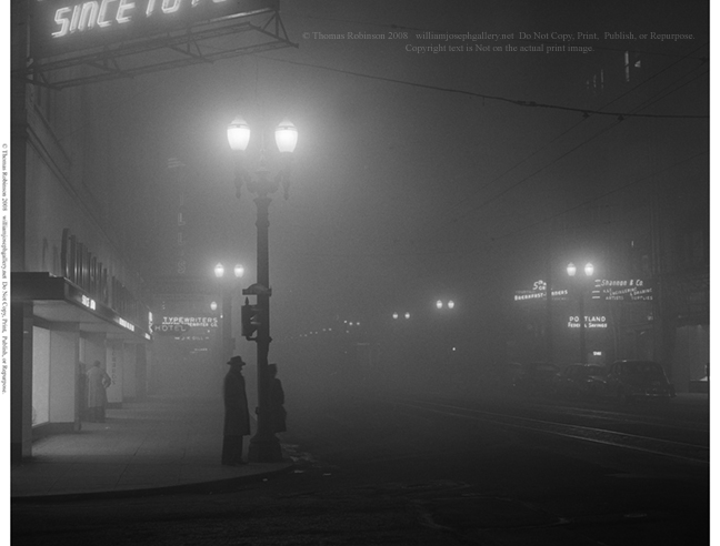
Notice how these two shots are powerful in their simplicity. The compositions and nature of b&w itself pulls the viewer into the lone subjects of these respective photos and causes their forms/shapes to stand out and engage us.
Hopefully, this is a thoughtful and useful exercise in understanding black and white. More to come in part 2.
daniel
Awesome blog, the family PJ is an interseting concept that you two are doing a great job of. I also appreciate the techincal information on processing the photos and compostion.
ReplyDeleteKeep up the good work.