
In the last couple posts of mine, I'm sure you noticed that I used images taken in similar environments. This has been intentional and by it, I'm hoping to make the point that an image might be taken in many different ways. Many of our homes are not photo friendly. It can be frustrating, between the clutter and imperfect wall hangings. A good photographer can see beyond that, though, to find order amidst disorder. My photo heroes are able to do this, including Steve McCurry and Sam Abell. We have talked about visual organization before and will continue to because it's elemental in documentary work (or any other type for that matter).
Look for items which might act as natural frames. Simple shapes, non-distracting items, etc. The more simple the item, the less it will detract from your subject (generally speaking). Use this approach to create symmetry.
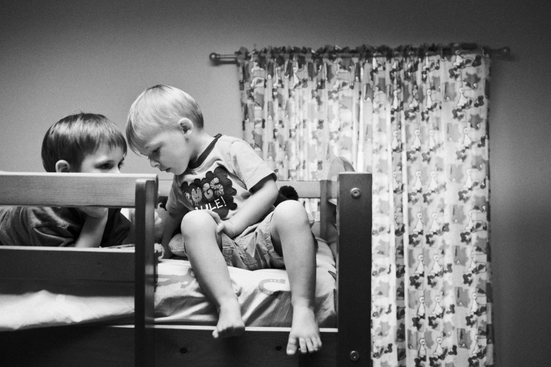
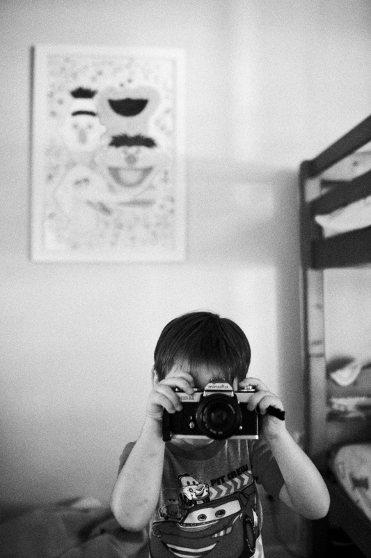
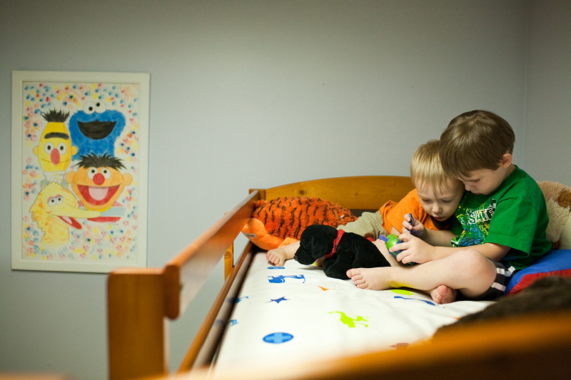
All 3 shots I'm sharing in this entry were taken in July in my boys' room. Two contain a singular element, which is the Sesame Street painting, the other a portion of the top bunk and curtains. The boys' room doesn't contain many interesting visual elements and I've learned that more is not always better (i.e., just shooting wide and letting the chips fall where they may). When the angle is right, the painting can be a useful element in organizing my shots.
The shot below is a recent favorite of mine. I like the symmetric and boxy feel of this composition. I like my oldest son's eyes, which are barely visible over the safety bar. I like the way he and his brother's bodies lean in to one another, while their gazes are not singularly focused on the same area. This helps draw attention to their closeness while adding a tension to the image. I like the simplicity of it all. The window helps to close out the composition and keep the viewer from straying too far. It's very graphic.
My oldest enjoys using this camera body, which I've "given" to him (a manual minolta body I learned on). Anytime I pull my camera out, he runs to get his as well. He was taking a photo of me. I lined up the painting to his right (rather than directly behind him) and used the edge of the bunk beds to close out the frame. If I left it open, it would still work but would have a looser feel rather than the staunch symmetry afforded by straight, closed lines.
This shot uses that same painting as an element to close out the shot. Again, I like placing the boys to one side of the frame (but still without pushing them to the far edges) and balancing them with a symmetrical element (painting). When you're seeking out a composition, look for those elements which will fill out a shot without becoming busy or "cluttery".
It took me a long time to learn to see natural lines. It takes practice. It takes studying good photography to see how they did it. I hope this is useful, guys. Have a good one.
Daniel
Congrats on the new baby!
ReplyDeleteThanks, Justin!
ReplyDeleteGreat article, awesome blog!
ReplyDeleteThese photographs are beautiful, and have inspired me for my relationships project at university. I am photographing a young mum, and her two children, but was sruggling for ideas :) And congratulations.
ReplyDeleteI just found your site and enjoy the spontaneity of the
ReplyDeleteimages and words with some helpful tips included.
It's something like what I've been doing. Great to find you!
Meryl Spiegel